Pathfinder’s New Visual Identity
Pathfinder's New Brand
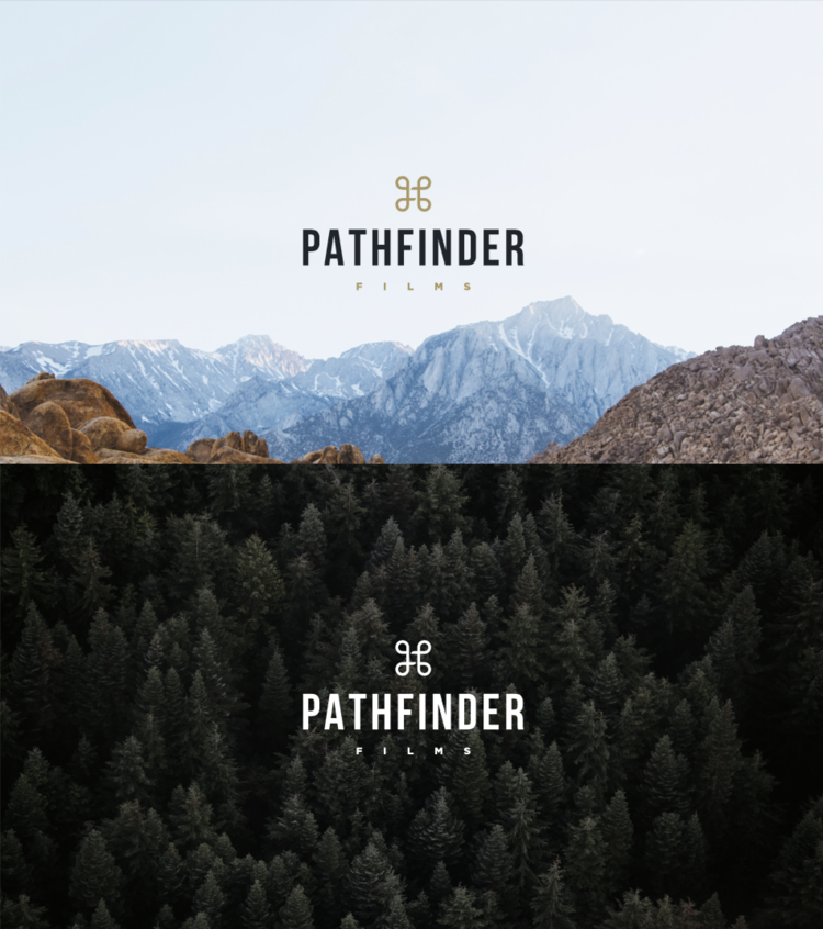
We've made an update to our visual identity. The previous mark served us well for the first three years of Pathfinder Films, but we were due for a refined look that better embodied our way-finding spirit and the careful attention that we bring to our filmmaking.
We were pleased to partner with Counsel Creative for the branding, and will be working with them to update our website this summer.
Meaning Behind the Brand
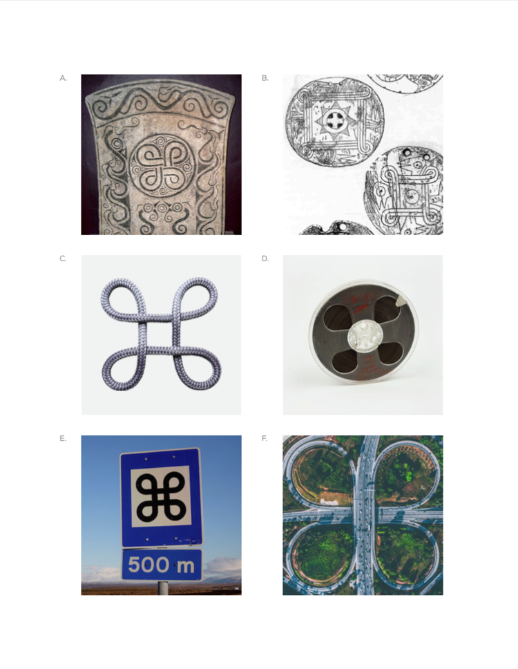
The clover-like mark at the very core of this brand is rooted in historical relevance. The continuous creative validation helped us to revive an iconic legacy and fashion a new interpretation that stands ready for another test of time.
Reminiscent of the roadways that lead us to places unknown, this shape reminds us that the path for one isn't the path for all. Pathfinder Films helps clients identify the right path and find the story that matters most. The difference maker.
From heraldic charges that represented design, disciplines, ceremony and rank in 400 AD to pendants found in the lower Tennessee River as early as 1250 AD, this is a symbol of significance. In 1530 AD, this was known as a "true lover's knot". In more recent history, you'll see a similar shape on old film reels and in Nordic street signs marking places of interest.

